Developing an online store is simple in appearance. But to create a good website, many tools are used, without the use of which the results can be much lower than possible, the funds invested in development will be wasted and the final result of the project will be failure. At best, you will simply miss out on some of the profits.
Below we will tell you about several such tools.
Tool first
Customer Journey Map
Stages CJM - Drawing up a collective image of the buyer. Several images.
- Determining touch points with the client. Where and how can we meet.
- Finding barriers to purchase. And especially the accumulation of such obstacles.
- Estimating labor costs for cleaning problem areas. Selecting optimal investments.
- Building a new, most convenient customer journey. This is the goal of CJM.
Tool second
User-friendly interface
Search engine algorithms pay great attention to the user’s behavioral factor and this greatly influences the result of your getting to the first lines of the search. That is, if the client is stupid, hangs up in search of the right button and performs many unnecessary actions, then the algorithms see this and lower such a site in the search results.
To prevent this from happening, it is important to thoroughly develop UX design and User flow*
We do it well.
*(Transition of users from one scenario of interaction with the interface to another. Custom route)
Tool third
Design system for web
The design must be with a clear understanding of the store's target audience. We select the right colors, fonts, shapes, images and other visual elements in order to maximize conversion and ease of use.
It’s good to use UI kits in your work, which allow you to create, reuse and update every detail of the site quickly and conveniently. For example, if a button changes in one place, then it will also change on all pages.
There is a large selection of modern design styles: Metro, Material, Flat, Neomorphism, Squaremorphism, Art Deco, Retro, Hi-tech, Polygonal and Hand-drawn styles.
It’s important to choose one that suits your brand specifically, or mix several and create something unique.
Interactive design elements kill two tasks at once:
-
They simplify interaction with the site using various “pop-ups”, “drop-downs”, transitions and other things. At the same time, they remove unnecessary things and add functionality.
-
Surprises and impresses the user, because... Not used on all sites. Watch a video with an example of how one of our sites works.
Tool fifth
Search by product
Product search is a critical interface element for a good online store.
When a person can easily and quickly find what he needs, he is happy. When difficulties arise, he switches to another tab and continues searching on the competitor’s website. The lower the cognitive load, the better.
It is important to understand that search requirements will be different depending on the type of products you have.
Let's look at two examples:
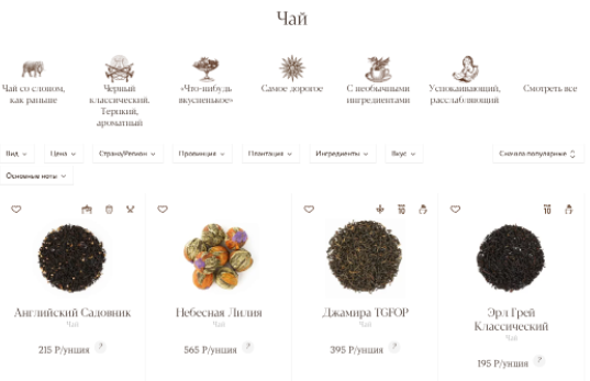
Online tea and coffee store Ounce
People regularly order tea, making their choice based on pictures and a short description. In the field of view, we placed only what the client needs, and the actions for purchasing were reduced to a minimum.
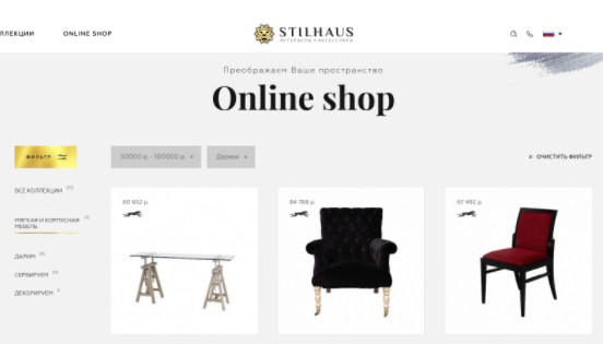
Interior gallery Stilhaus
Comprehensive information is important here for a closer study. You need technical specifications and a convenient filter for them.
Tool sixth
Smart filtering for SEO
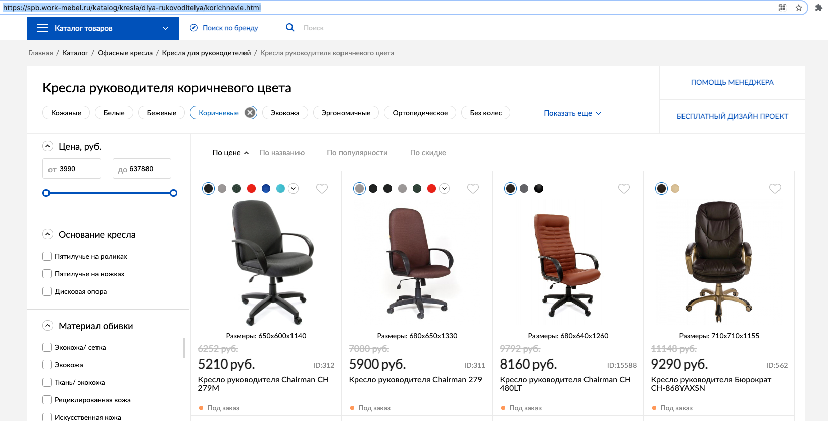
The filter by product has been made convenient. But it can also be made a tool for bringing in additional visitors! How? Yes, like this:
You need to make sure that the filtering result is not only a product, but also a new URL address. It is usually not optimized for search engines.
- Show get parameters in the address bar
- No unique meta tags
- H1 Headings do not change to current ones
And also if the layout is based on technology SPL*,React**, Angular***, Vue****, it is not so easy to change the URL addresses. But we do it.
(*SPL — This is an abbreviation for Smart Programming Language, or “Smart Programming Language”. SPL is designed to make it easy and efficient to create programs that run on any device - tablets, laptops and smartphones running Windows 10)
(**React — is a declarative, flexible and efficient JavaScript library for creating user interfaces. It makes it possible to assemble a complex UI from small, isolated pieces of code called “components.”)
(***Angular — Open source JavaScript framework. Designed for developing single-page applications. Its goal is to enhance browser applications based on the MVC pattern, as well as simplify testing and development.)
(****Vue — An open source JavaScript framework for creating user interfaces. Easily integrates into projects using other JavaScript libraries. Can function as a web framework for developing single page applications in a reactive style.)

If you implement a smart filter, meta tags and relevant headings will be generated automatically. This will make it possible to additionally appear in search results for low-frequency targeted queries. Visits from such requests give a good conversion, which again has a positive effect on SEO.
CONCLUSION: the less time a person spends searching for a product, the better it is for him and the closer he is to purchasing.
Tool seventh
Integration with 1C
The service for creating an online store may also include a connection to your 1C system, if you have one. Integration provides the following capabilities:
- Uploading product data to the website - prices, characteristics, images, etc.
- Update and exchange of website and 1C data in real time.
- Uploading information according to a schedule, at the appointed time.
- Shows the availability of goods in the online store, and in 1C the exact number of balances.
- Uploading counterparty data to the online store website from 1C.
- Notification of errors during the download process.
- Other automation processes.
All this greatly simplifies the company’s work and provides up-to-date information to the site user.
Tool eighth
Website responsiveness
EVERYONE already accesses the Internet from smartphones, even grandmothers. Therefore, adaptation to the mobile version is simply mandatory, there’s nothing even to argue about. But the ratio of users accessing from a smartphone and from a computer varies. That’s why we create an online store based on your analytics.
If you have a predominance of mobile users, then the site is created for Mobile Only.
If the audience is divided approximately equally between smartphones and computers, then we proceed from the Mobile First concept. That is, first the mobile version is made, and then the desktop is added.
If more users are still from PCs and laptops, then we use the Desktop First method. Here it’s the other way around - first for the computer version, and then the site is adapted for a mobile phone.
Tool ninth
Payment system
There are two payment options on the site:
- Aggregator This is a specialized service - Robokassa, YandexKassa and others. The advantages of aggregators are a large number of payment methods, in addition to bank cards, as well as minimal connection time. You have to pay a high commission for this. And not only from the seller, but also from the buyer.
- Acquiring This is a direct agreement with a specific bank. The advantages are the low commission percentage and the speed of receipt of money into the current account. The downside is that you can only accept payments from bank cards of certain payment systems that the selected bank has.
This tool allows you to increase the check amount by offering a more expensive option or selling additional items.
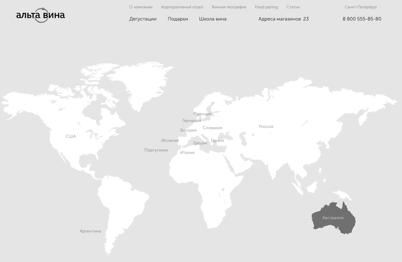
Here is an example we created for an online wine store:
We posted a map on which you could select a region and a specific vineyard. Thus, a person develops a desire to be involved in a higher level and this pushes him to buy more expensive wine.
In addition, we put on the website an offer to add cheese to wine. After all, everyone loves to drink wine and eat it with cheese. This became a great upsell, which increased the cart check.


