Corporate identity development
I
Задача
Create a logo and corporate identity for a low-rise residential complex
"Italian Quarter" in Romanovka. Project concept — cosy
suburban block not far from St. Petersburg. At the basis of architecture
and stylistics — the idea of creating a sunny corner for living in the north
city, images of a picturesque Italian suburb and family values.
II
Logo search
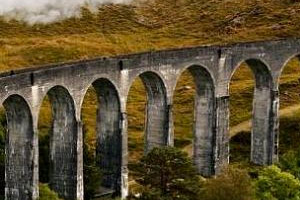
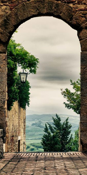
Starting point — warm images of Italy: sun, street,
paving stones. Further there were associations with classical Italian architecture
and even with a pizzeria. But during the search, we came to the fact that
This is not enough. Something completely new and unusual was required.
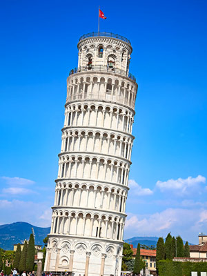
It was decided to refuse the font part
from antiqua, classic for Roman writing.
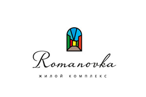
III
Solution
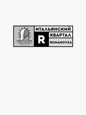
As a result, we managed to find a sign that visually connected the residential
complex in Romanovka and an authentic element of Italian life. This sign —
symbiosis of house plans with the shape of Italian shutters. It is concise and easy to read
and looks modern — no old Italy.
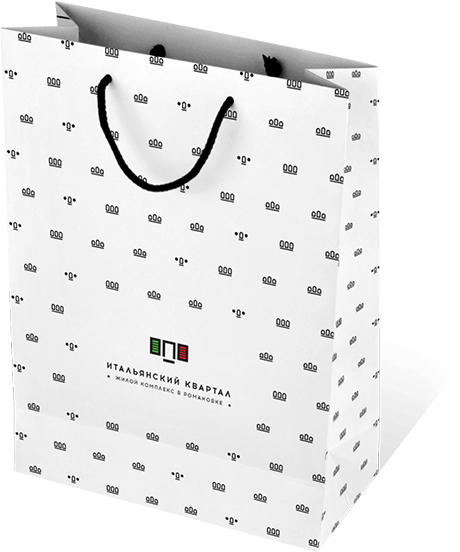
Final version of the logo
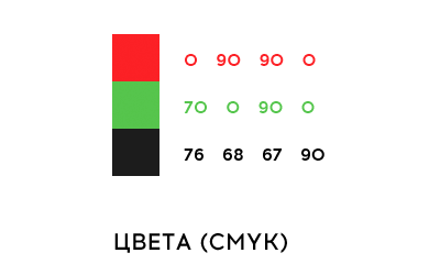
Corporate colors
Based on Italian
flag
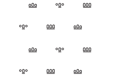
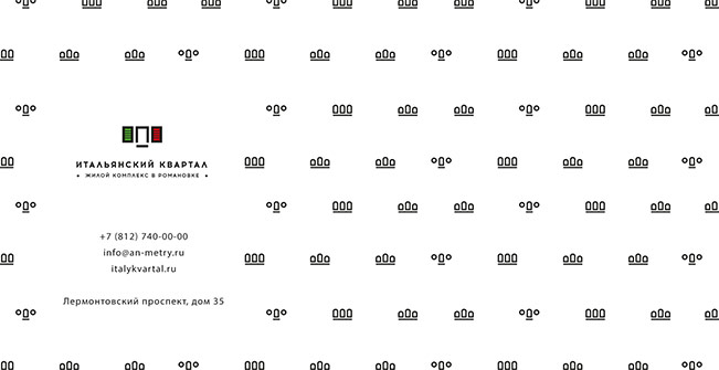
Corporate pattern
Based on Italian
architecture
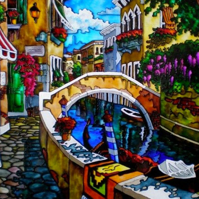
IV
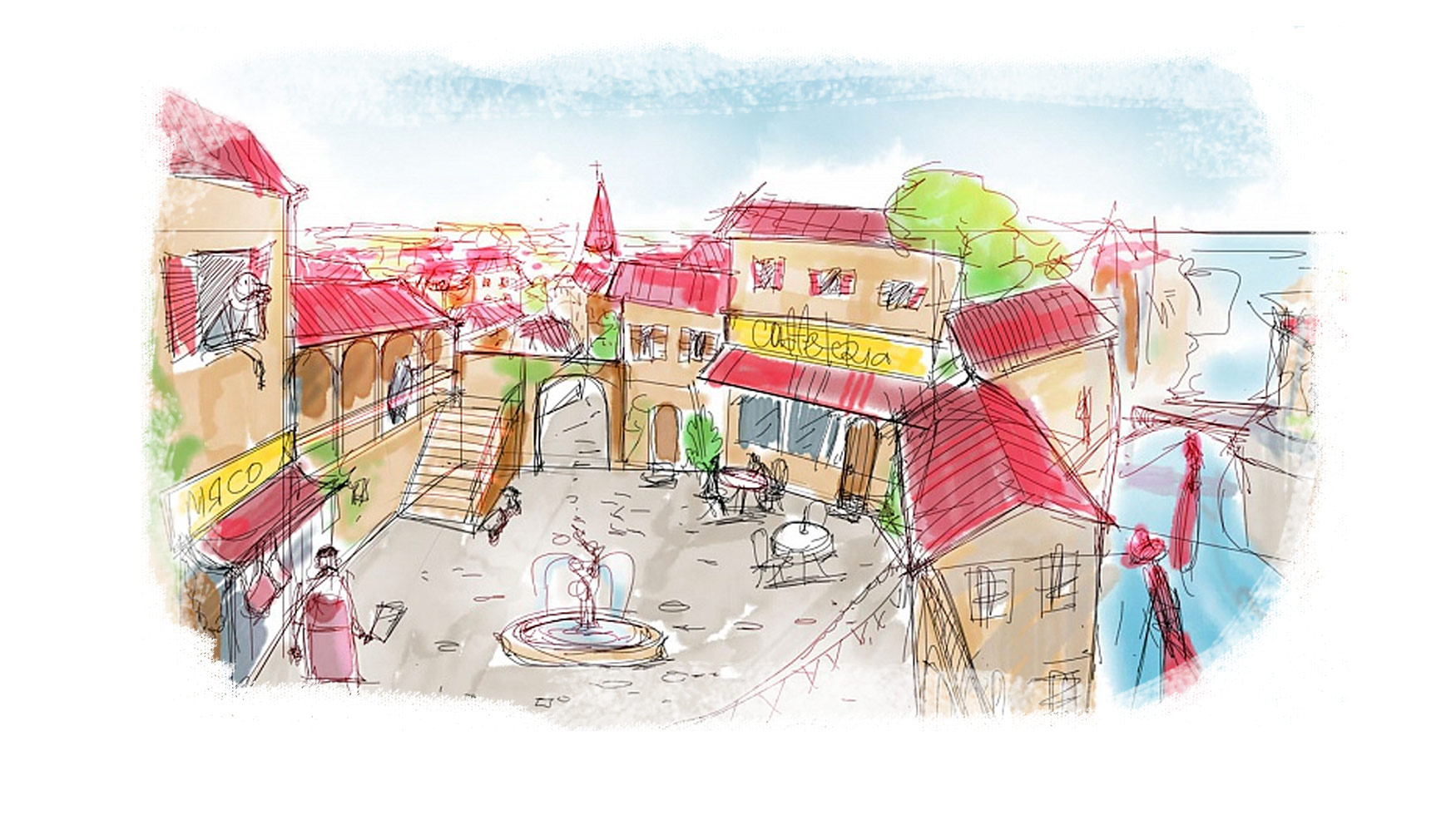
illustrations
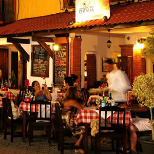
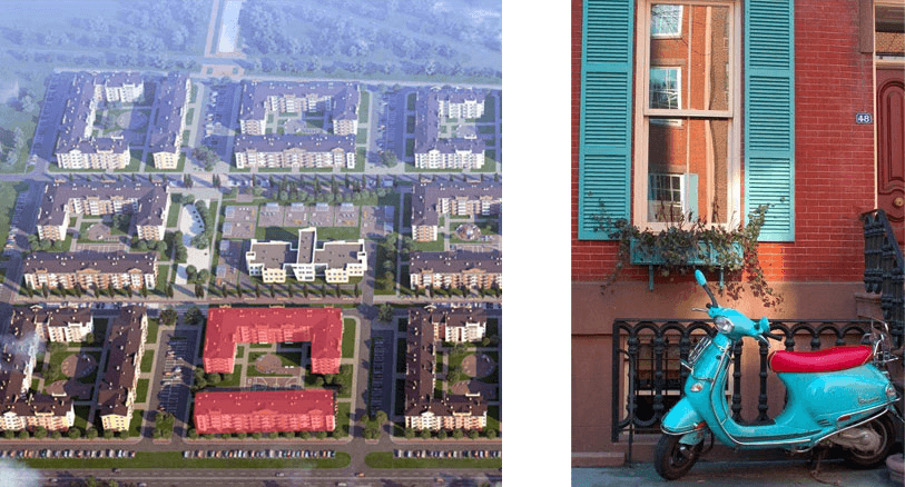
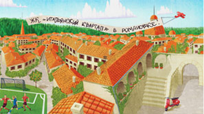
In as images on the website and in printed
production it was planned to use renderings of a residential complex. But it soon became clear:
something is missing here.
More sun and
comfort!
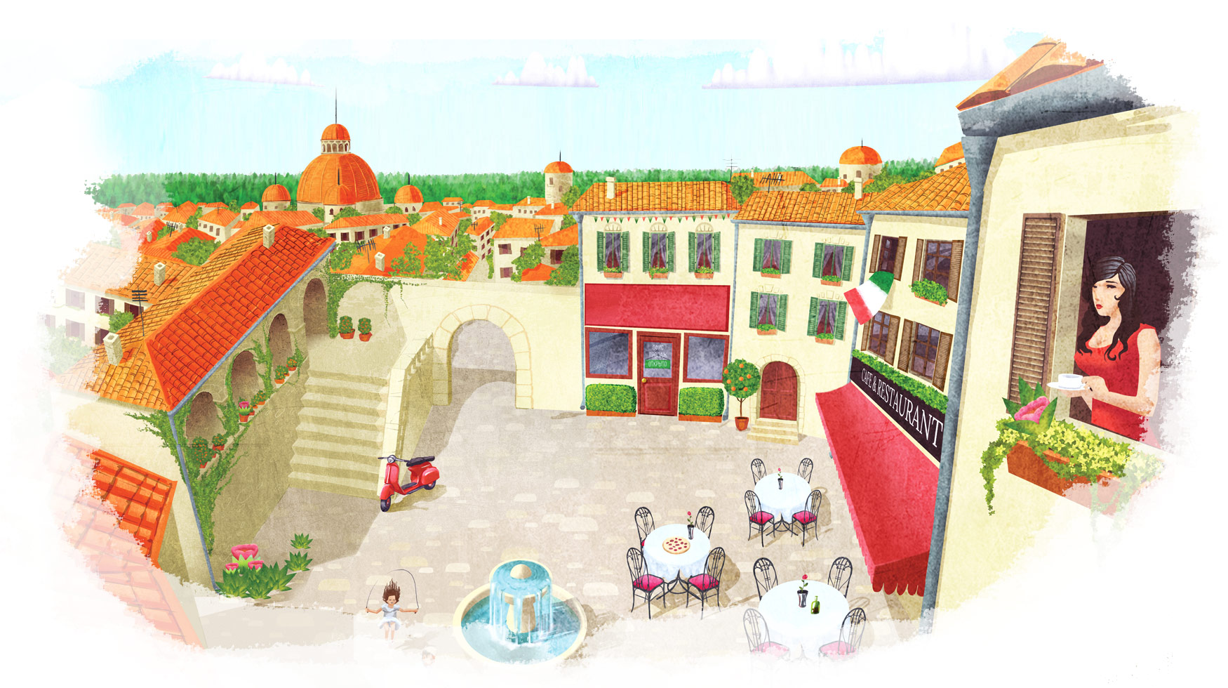
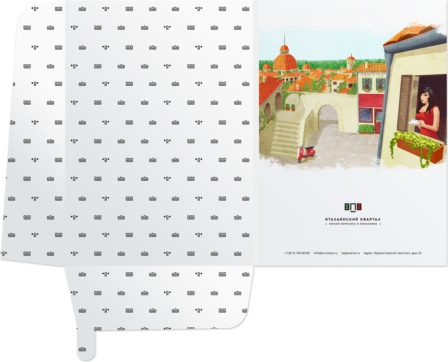
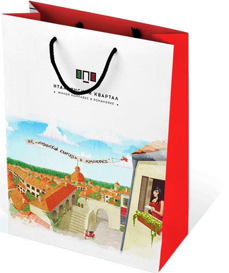
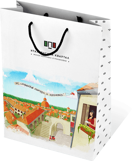
We developed branded illustrations for printed materials
and the main page of the site. It turned out to be what you need — bright, sunny
an image that exactly corresponds to the concept of the residential complex "Italian Quarter".
V
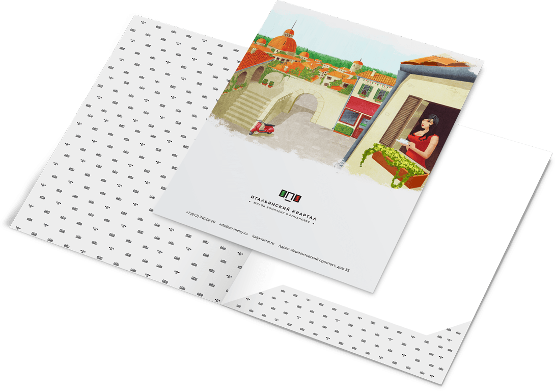
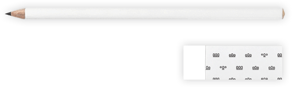
Form style
Competently and unobtrusively used elements
design
on different types of corporate paraphernalia.
on different types of corporate paraphernalia.

Thank you for your attention!
And also for the “Italian Quarter”
we developed website
we developed website
itkvartal_brand-en
Phone
